After covering the chapters on ASP.NET Core, on the The Front-End Developer Toolset (and mindset) and on Angular, let's have a look at Chapter 4, which is all about Bootstrap. A few days I said that Semantic UI has class nicer naming than Bootstrap (and easier to remember) for specifying columns sizes in grids. Well, let's see how the responsive grid is defined in Bootstrap.
This is an extract from Chapter 4 of my upcoming book "Front-end Development with ASP.NET Core, Angular, and Bootstrap".
Bootstrap Grid System
A basic feature of any CSS framework, the grid system allows you to create a page layout based on a series of rows and columns. On top of the basic behavior, Bootstrap provides a 12-column fluid grid layout that adapts to the size of the screen.
Bootstrap defines four classes of devices, and for each of them there is a different CSS class prefix:
- Extra small devices, like smartphones, with a screen size smaller than 768px (.col-xs-)
- Small devices, like tablets, with a screen size bigger than 768px but smaller than 992px (.col-sm-)
- Medium devices, like normal laptops, with a screen size bigger than 992px but smaller than 1200px (.col-md-)
- Large devices, like desktops, with a screen size bigger than 1200px (.col-lg-)
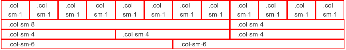
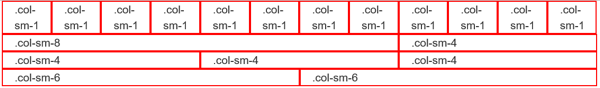
If size of columns is specified with class .col-sm-*, it means that everything smaller than 768px would get the default vertical stacked layout. To get the cells stacked for both smartphones and tablets but to be horizontal on desktops, the class .col-md-* should be used.
But more complicated layouts can be achieved by combining different classes. For example, if you do not want the smartphone version to stack horizontally but you want two columns per row, you can define this behavior by using col-xs-6 col-sm-1.
On the other hand, if you want the same layout in all device sizes, you just need to apply the class for the smallest size, and all bigger sizes will inherit it. For example, if you always want two columns per row, no matter the size, just apply col-xs-6.
Just by reading the extract from the chapter it looks pretty complicated, but with the help of samples and figures everything is clearer. If you are interested, consider pre-ordering my upcoming book "Front-end Development with ASP.NET Core, Angular, and Bootstrap".
If you want to see more of what is coming, come back tomorrow for more tips.